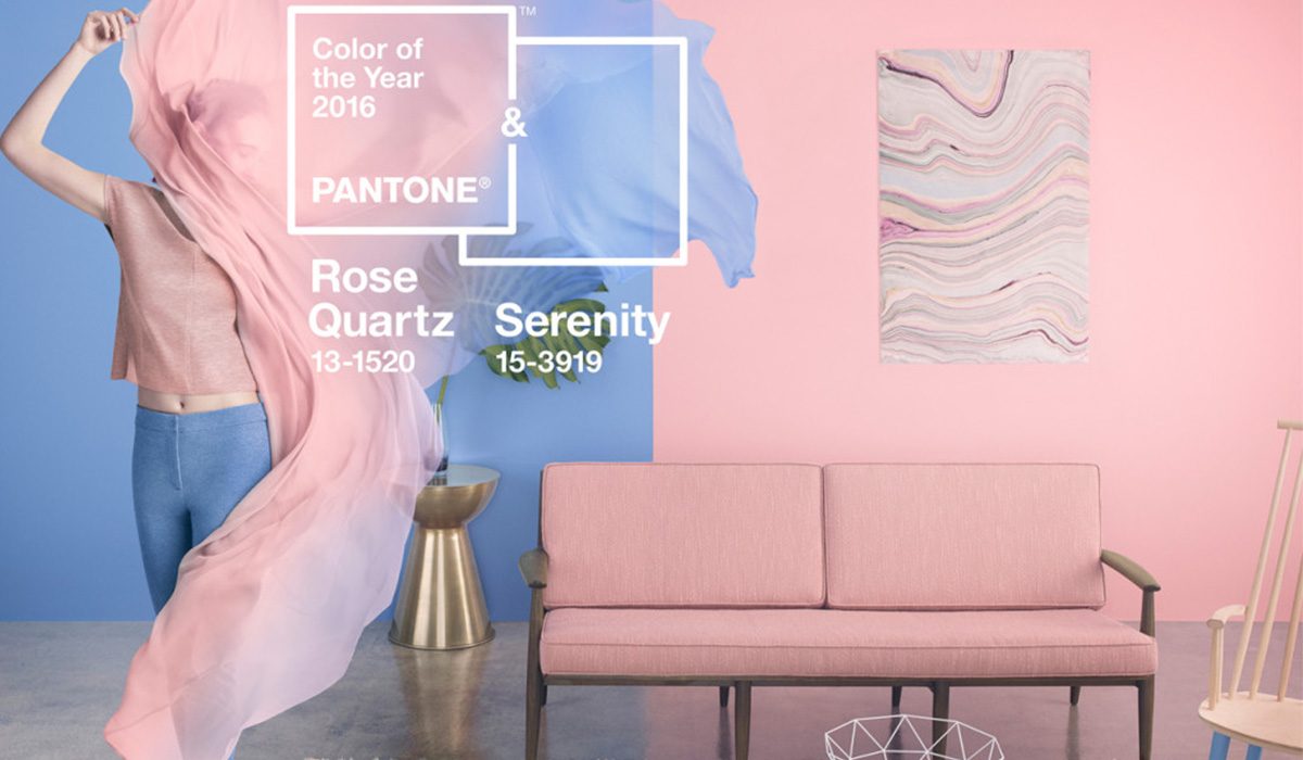
Ежегодно все дизайнеры ожидают вердикта Исследовательского Института Цвета Pantone. Два раза в год мир получает модные цвета, на которые ориентируются различные отрасли. Однако в этом году дизайнеры были ошарашены известием о сразу двух цветах года: розовый кварц и голубая безмятежность.
Напоминаем, что в 2015 году был модный цвет Марсала

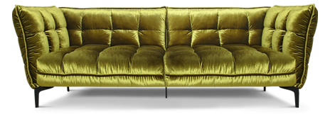
В интерьере он придавал оттенок благородной дороговизны. Однако с насыщенным гранатовым оттенком нужно быть особенно осторожным. Можно сильно утяжелить им интерьер. Конечно, особенно выигрышно смотрелась в нем велюровая мягкая мебель, придавая эффект дополнительного бархата. С помощью этого цвета года можно было ненавязчиво расставить акценты, выполнив в нем только отдельные элементы интерьера (декоративные подушки, шторы).

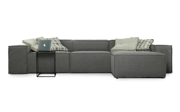
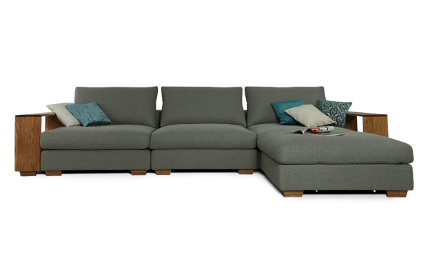
По словам экспертов мебельного текстиля, в моде сейчас все размытые пастельные неяркие и как бы припыленные оттенки. Особенно актуальна грязно-розовая гамма: персик, корал, грязно-голубой и грязно-бирюзовый. Бежевый, коричневый и лиловый — уже вышли из моды.
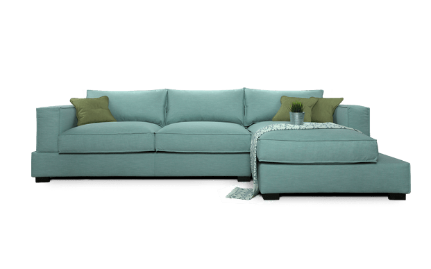
Цвет Голубой безмятежности ассоциируется со свежестью, безграничностью, уверенностью, стабильностью и спокойствием. Розовый кварц в свою очередь ассоциируется с нежностью, теплом, уютом, релаксацией и благополучием. Эти два цвета 2016 года прекрасно между собой сочетаются. В интерьере они способны придать удивительную атмосферу в Вашем доме.

Как обыграть модные цвета?
Можно цвет стен выбрать в одном из модных оттенков, а другие элементы сделать более мягкими. Либо же наоборот: весь интерьер сделать в нейтральном цвете и только некоторые его элементы разбавить с помощью модных оттенков года. Очень красиво будет в гостиной смотреться диван одного цвета, а кресло другого, но декоративные подушки на диване должны соответствовать цвету кресла. С помощью такой цветовой комбинации Вы можете выбрать кресло и диван из разных комплектов, правильное цветовое сочетание позволит их сблизить.

Аналогично можно делать с другими элементами интерьера. Например, диван можно заказать в безмятежно голубом цвете, а его компаньоном выбрать плед, небрежно накинутый на кресло, светло оливкового оттенка. Это будет отличной связкой между всеми элементами интерьера.

Все актуальные оттенки Вы сможете найти в каталогах мебельных тканей Italvelluti в наших салонах. Эти каталоги — одни из немногих, которые предлагают несколько оттенков одного цвета, это позволяет играть с тональностью интерьера. Если Вы видите каталог, который содержит большую палитру (несколько оттенков голубого, розового...), это говорит о том, что ткань делает текстильная фабрика с сильными производственными мощностями. Мало кто способен позволить себе разрабатывать ткани в нескольких оттенках одного цвета. Если посмотрите на недорогие каталоги тканей, то заметите, что там, как правило, представлены цвета в одном-двух оттенках. И их перечень примерно таков: белый, черный, синий, красный, розовый, бежевый. Эти цвета из одной коллекции практически невозможно комбинировать, соответственно Вы не сможете сделать легкие цветовые акценты. Поэтому если Вы любите экспериментировать, обращайте свое внимание на каталоги, которые имеют большой ассортимент красочной палитры. В основном это оригинальные итальянские ткани, которые Вы сможете посмотреть в любом нашем салоне.
Стильные диваны 2016 от Zlatamebel